
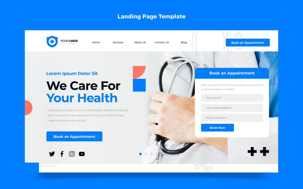
When someone clicks “Book Appointment,” they’re already halfway to becoming your patient. What happens next depends on your healthcare landing page design.
A well-crafted page can turn interest into action by guiding visitors to book confidently, trust your clinic, and feel that they’re in safe hands.
If you run a clinic, medical centre, or healthcare business, this guide will walk you through how to create a page that wins hearts, builds credibility, and encourages patients to take the next step.
Table of Contents
Is Your Healthcare Landing Page Costing You Patients? (The Answer Might Shock You)
A landing page acts as your clinic’s digital front door. It’s often the first impression people get of your healthcare services, and within seconds, they decide whether to stay or leave.
Good design doesn’t only look appealing; it improves user experience, builds trust, and helps with conversion rate optimisation.
Patients want convenience, clarity, and confidence when they’re searching for help.
When your design combines these elements, booking a consultation becomes effortless for new visitors.
A well-structured website built with patients in mind sets the tone for trust. Learn more about building a professional corporate website that reflects your healthcare brand
Design That Heals: Building Trust Through Healthcare Landing Pages
Healthcare isn’t the same as retail or lifestyle industries. Patients need reassurance, not persuasion.
In this space, landing pages must be built with empathy, trust, and ease of use at their core.
Key elements that set healthcare landing pages apart:
| Element | Purpose |
| Professional visuals | Real photos of doctors, nurses, or clinics create emotional comfort. |
| Patient-centred messaging | Speak in friendly, clear language. Avoid jargon or medical complexity. |
| Appointment scheduling | Booking should take seconds, not minutes. Include clear booking buttons. |
| Compliance and privacy | Show how patient information is handled safely. |
| Accessibility | Ensure fonts, colours, and layout work for all users, including elderly visitors. |
This human-centred approach builds trust and positions your clinic as a dependable healthcare partner.
Step-by-Step Guide to Building a Healthcare Landing Page That Converts
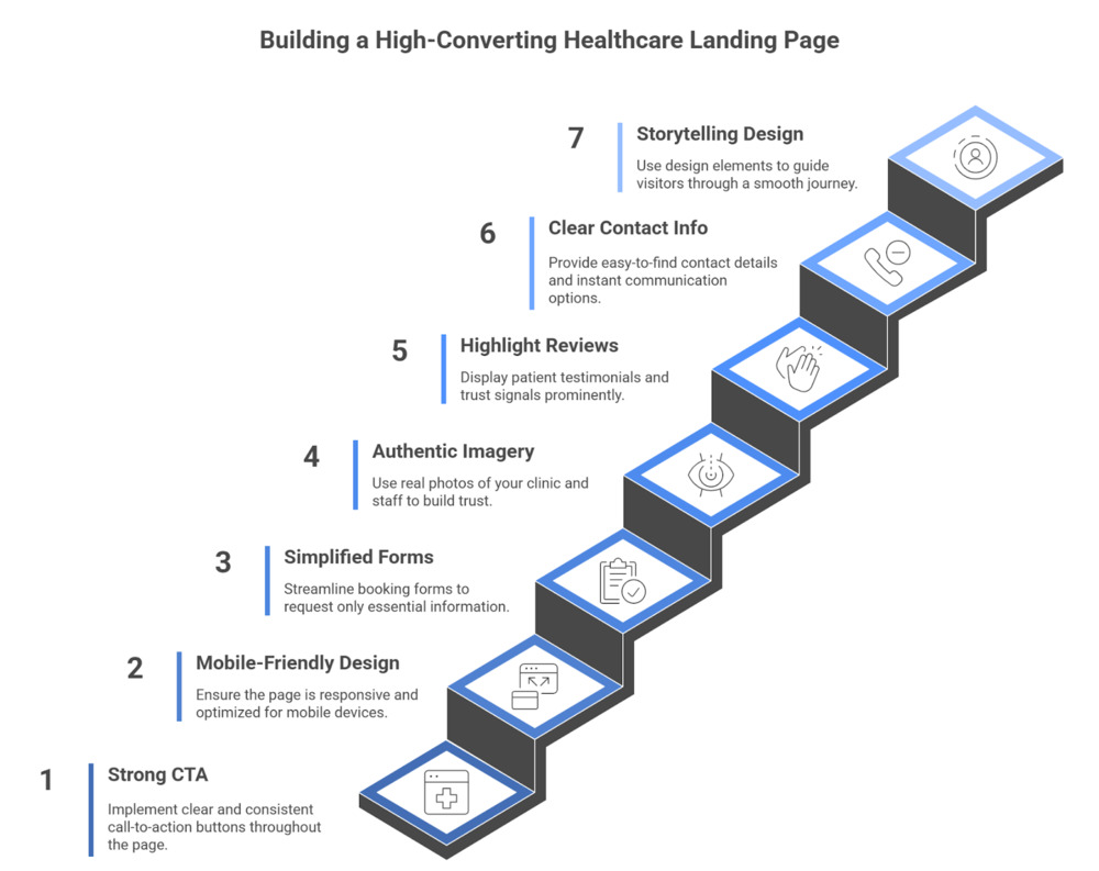
Every healthcare landing page should lead visitors to a single goal to take action.
Follow these steps to turn your page into a conversion-friendly experience.
1. Use a Strong, Clear Call to Action
The call to action (CTA) should be easy to find and consistent throughout your page.
Common CTAs for the medical business include:
- “Book Appointment”
- “Call to Schedule”
- “Consult Our Specialists Today”
Place the CTA button above the fold, repeat it near testimonials, and include one at the bottom of the page.
A good landing page builder like Elementor or Unbounce can help design flexible sections that keep CTAs visible and consistent.
Combine your booking-focused landing page with targeted ad campaigns to reach more patients. Try Facebook Ads or Google Ads to bring qualified traffic to your site.
2. Keep It Simple and Mobile-Friendly
A cluttered layout confuses patients. Simplicity wins every time.
Focus on responsive design so your page adjusts smoothly on any screen such as mobile, tablet, or desktop.
According to Google’s UX Playbook for Healthcare, mobile users form opinions within seconds, so mobile optimisation is vital.
Ensure buttons are large enough to tap, text is readable, and forms open easily.
3. Make Your Form Easy and Friendly
Many visitors drop off when the booking form looks long or complicated.
Simplify your form for better user experience:
- Request only essential patient information (Name, Contact, Preferred Time).
- Add a privacy assurance note: “Your data is confidential and secure.”
- Use friendly phrasing such as “Let’s find your best appointment time.”
Shorter forms improve conversions and feel approachable.
4. Show Real People and Real Places
Patients connect with authenticity.
Replace generic photos with real images of your clinic, staff, and facilities.
Adding an introduction to your team helps humanise your clinic and showcase your healthcare expertise.
Example: A dental clinic in Kuala Lumpur improved booking rates by 27% after replacing stock photos with genuine team images and adding a short “Meet Our Doctors” video.
(Source: Clinic’s internal Google Ads and analytics report, 2024)
5. Highlight Reviews and Trust Signals
Reputation plays a huge role in healthcare. Show what others say about your service.
Effective trust elements include:
- Patient testimonials with photos.
- Verified Google Reviews.
- Awards or accreditations displayed clearly.
- Media coverage or medical events your team participated in.
These small details reinforce reliability and transparency, making patients more comfortable booking with you.
6. Showcase Clear Contact Information
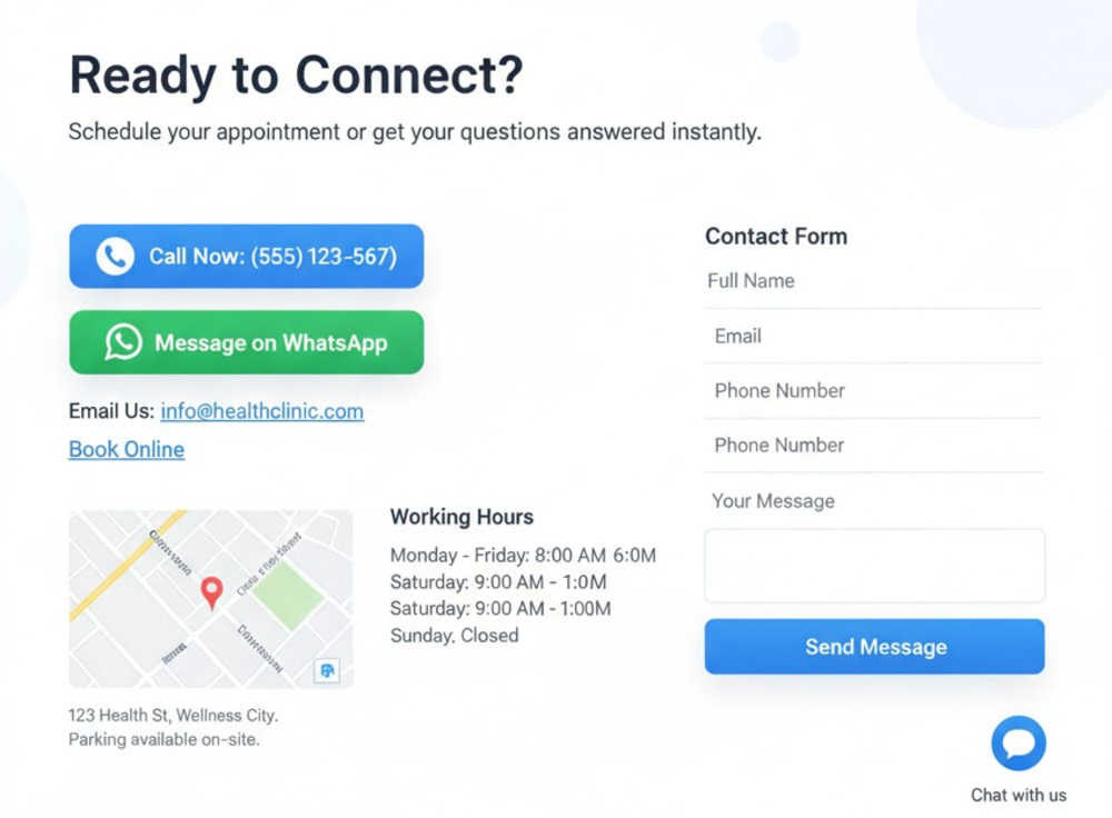
Patients shouldn’t have to search for how to reach you.
Include visible contact information such as:
- Phone number and email.
- Click-to-call or WhatsApp buttons.
- Map location and parking guide.
- Working hours near the call to action buttons.
Also, consider adding a chat option or contact form for instant queries. These help increase patient engagement and reduce drop-offs.
7. Use Design to Tell a Story
Good landing page design guides visitors through a smooth journey:
Awareness → Trust → Decision.
Structure your content with:
- A warm opening headline.
- Key healthcare services summarised in short blocks.
- Visual hierarchy that draws attention to booking options.
Consider using landing page templates built for medical practices or healthcare institutions, as they already follow tested design structures.
You can then adjust colours, tone, and photos to match your branding.
Unlock Trust and Conversions: Essential Design Elements for Healthcare Landing Pages
A successful medical landing page should do three things: reassure, inform, and convert.
Here are a few features that can lift conversions instantly:
| Design Element | Why It Matters |
| Simple layout | Keeps focus on the booking journey. |
| Clean typography | Improves readability for all age groups. |
| Consistent colour palette | Creates a calming, professional atmosphere. |
| High-quality visuals | Builds confidence in your environment. |
| Secure connection (HTTPS) | Shows your site protects personal data. |
These visual cues create a strong emotional impression and support conversion rate optimisation.
Great visuals work best when supported by the right words.
Let our content marketing experts craft engaging stories that convert visitors into loyal patients.
How to Improve Performance Over Time
A good landing page evolves with patient needs.
- Use data to refine and grow your results.
- Track visits and clicks using Google Analytics.
- Review form completion rates.
- Experiment with different button colours or CTA phrases.
- Check bounce rates to identify sections that may confuse visitors.
A landing page builder with testing tools can simplify these experiments, letting you tweak elements easily.
If testing still shows low conversions despite improvements, your site layout might need a deeper revamp.
Alongside design improvements, strong SEO for clinic practices help your landing page rank higher on Google, driving consistent patient traffic without relying solely on ads.
Discover how a strategic B2B website redesign can help boost ROI and patient bookings.
Bonus Tip: Pair Your Page with Smart Advertising
A high-quality landing page works best when supported by targeted traffic.
Combine your page with digital ads that match your audience’s intent.
For example:
- Run a Google Ads campaign promoting “Eye Check Appointments.”
- Link it directly to your healthcare landing page featuring your optometrist’s photo and clinic contact.
- Test messaging variations to find which headline drives the most clicks.
This method ensures visitors see exactly what they expect when they click, improving both trust and performance.
Reach your audience in the right language and tone.
You can also explore local service ads for clinics. These verified listings appear at the very top of search results, helping your healthcare brand capture more local patient leads instantly.
Learn how localising ad campaigns improves conversions, or boost visibility with our local SEO service.
5 Common Mistakes to Avoid in Healthcare Landing Page Design
Even experienced clinics can make small design choices that hurt conversions.
Avoid these pitfalls:
- Using stock photos that look impersonal.
- Forgetting to include contact details in multiple places.
- Adding too many links that distract users.
- Overloading with text instead of visuals.
- Ignoring mobile testing.
Each mistake may seem minor, but combined, they can cost your clinic valuable appointments.
Turn Every Click into a Confident Patient
A strong healthcare landing page design helps your clinic stand out in a crowded market.
It builds credibility, improves patient engagement, and increases appointments with clarity and trust.
Keep the journey simple. Focus on your patients’ comfort, provide visible call to action buttons, and maintain consistent branding across all devices.
As your healthcare business grows, use data to adjust design and strengthen results.
Ready to design a landing page that attracts, reassures, and converts?