When it comes to building a B2B website, design and content often pull in different directions. Designers want something bold, original, and visually striking. Buyers, on the other hand, want speed, logic, and clarity.
That tension creates the classic dilemma: do you go for creativity or clarity?
The truth is that successful B2B website content blends both. Creative design should highlight clarity, not bury it.
A site that looks stunning but hides the value proposition behind jargon or complex website navigation will not convert. In the B2B space, clarity always beats complexity.
Table of Contents
Why Clarity is Non-Negotiable in B2B Website Design

Business buyers are rarely making impulse decisions. Your website needs to speak to everyone involved. The audience spans technical users, finance teams, and executives, with each group demanding quick access to unique data.
Visitors form an opinion within seconds. That’s why the five-second test matters.
Ask yourself:
- What does this company do?
- How do they help me?
- What’s the next step?
If the answers aren’t clear, you risk losing potential leads.
A strong B2B website content strategy fixes that.
- H1: Clearly state your value proposition.
- H2: Highlight a key benefit or outcome.
- CTA: Show the next step. Get a quote, book a demo, or contact sales.
Use design elements like typography, layout, and colour to guide attention, not distract from your message. Clarity builds trust and trust drives conversion.
Building this foundation starts with the right corporate website design that communicates value clearly from the first second.
Fact Over Fluff: Data Anchors Your B2B Website Content
In the B2B buying process, facts and numbers outweigh vague claims. A line like “We increase ROI by 25%” carries weight ; “We’re the best in the industry” does not.
Grounding your content in specifics builds trust and reassures even the most sceptical decision-makers. If you’re planning a redesign, think about what measurable ROI your website will deliver.
a. Use Case Studies That Tell a Story
A strong case study should follow a clear three-part flow:
- Challenge: What problem did the client face?
- Solution: How did your product or service solve it?
- Results: What measurable outcomes were achieved?
If your SaaS platform cuts order processing time by 40%, show it boldly. Use visual hierarchy and typography to make key numbers stand out at first glance.
b. Be Transparent for Technical Stakeholders
Provide easy access to:
- Product documentation
- Technical specifications
- Pricing information
Avoid hiding crucial details behind unnecessary forms or gated content. Transparency builds confidence.
c. Balance Openness with Lead Generation
Encourage engagement through genuinely valuable offers , such as free trials, live demos, or webinars.
Gate content only when it delivers clear value to the visitor.
When Creativity Hurts Conversions: Spotting the Red Flags

A creative B2B website design can make a strong impression, but when visual flair overshadows clarity, it begins to hurt performance.
Instead of improving user engagement, it creates friction that slows the sales journey. Here are some red flags to watch for and how to fix them.
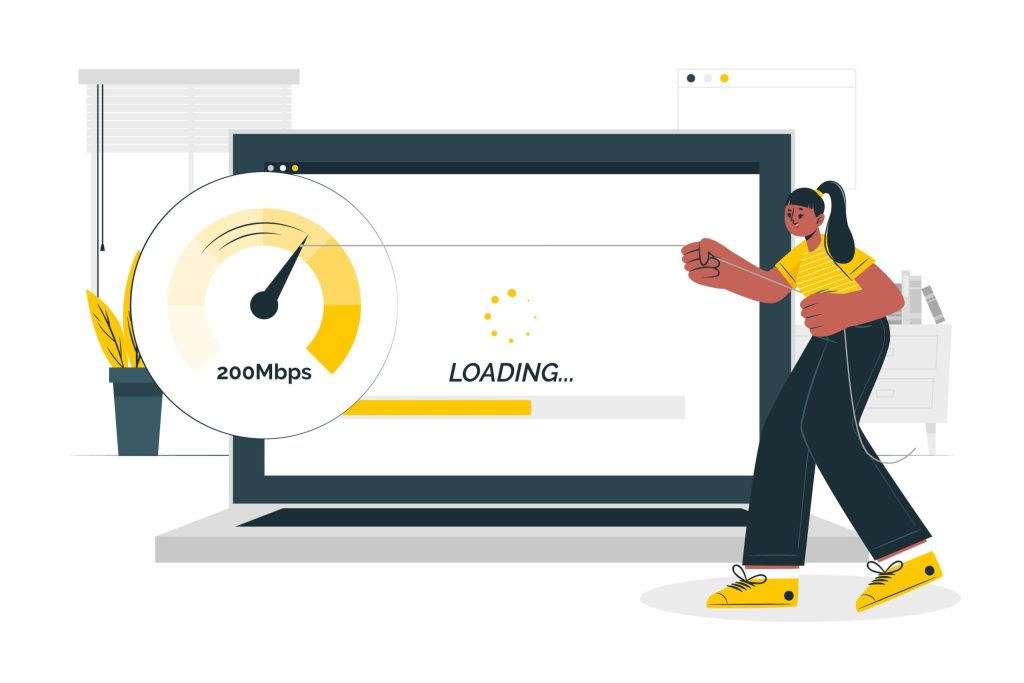
1. Your Homepage Takes Too Long to Load
If a homepage loads in more than three seconds, you’re likely losing potential leads. Heavy animations, oversized hero videos, or uncompressed images look stylish but harm website performance and push up bounce rates.
A fast, focused site always beats a flashy one. Use page speed optimisation and image optimisation to address this.
2. Users Struggle to Navigate
Creative menus and hidden pathways might impress designers but they frustrate buyers. B2B audiences expect simple, predictable website navigation that lets them find service descriptions, case studies, or contact details instantly.
3. The Copy Sounds Clever But Says Nothing
Catchphrases like “empowering synergy for tomorrow’s innovators” may sound exciting but they fail to explain your value proposition. Buyers prefer clear statements that show how you solve their problems and support their business objectives.
4. Design Distracts From the Call to Action
When visuals or animations bury your call to action, lead generation slows down. CTAs should be visible, concise, and relevant. Whether it’s booking a demo, requesting a quote, or downloading a white paper.
Page load time is just one part of the equation. Our SEO services in Malaysia ensure your site performs well in both search and speed tests.
Red Flags vs Fixes
Before you spend another pound on traffic, audit your site against these crucial red flags that are secretly driving potential buyers away.
| Red Flag | Why It Hurts | Quick Fix |
| Homepage loads in over 3 seconds | Visitors drop before reading content, higher bounce rate | Apply page speed optimisation and image optimisation |
| Hidden or complex menus | Buyers can’t find information, lowering user engagement | Use clear top-bar menus and consistent site architecture |
| Jargon-heavy headlines | Doesn’t communicate your value proposition | Rewrite with measurable benefits and proof points |
| CTAs pushed below the fold | Users miss the next step, lower click-through rates | Place CTAs early, reinforce with social proof (e.g. testimonials, case studies) |
Need help implementing these fixes? Our team builds conversion-driven B2B websites trends designed to eliminate hidden friction points.
Quick Self-Audit Checklist
- Check your homepage loading speed.
- Review how quickly visitors can access your core services.
- Rewrite vague headlines into clear benefit statements.
- Make sure your CTA appears early and guides the B2B sales funnel.
Strategies for Conversion-Driven B2B Website Design
If clarity is the rule and creativity is the amplifier, how do you bring them together? Here are three strategies:
1. Content-First Wireframing
Start with the content blocks that matter most like case studies, product details, pricing, and service descriptions. Design should frame these blocks, not treat them as filler.
When content drives design, the result aligns with business objectives and supports CRM integration for smoother customer relationship management.
2. Whitespace and Visual Hierarchy
Whitespace is not empty space; it directs attention. Combined with contrast, colour, and font weight, it guides the reader’s eye to the most important content. This improves user experience and conversion rate optimisation.
3. Elevating Trust Signals Creatively
Trust signals matter in B2B, but they don’t have to be dull. A plain list of logos can become an interactive carousel of case studies.
Compliance information can be displayed with icons instead of long disclaimers. This builds social proof and strengthens brand credibility.
Pairing design with strong content marketing and video making ensures your trust signals resonate more effectively.
Poor vs Purposeful B2B Website Design
Stop letting complex, over-designed pages kill your sales pipeline; this comparison highlights how small, purposeful design choices drive significant B2B revenue.
| Scenario | Over-Designed B2B Website | Conversion-Driven B2B Website |
| Homepage | Heavy hero video hides the message | Clear headline with value proposition and CTA |
| Navigation | Hidden menus, confusing paths | Standard top bar with simple site architecture |
| Case Studies | Buried under creative layouts | Highlighted with measurable results |
| Forms | Long with vague labels | Short, precise, with trust-building microcopy |
| Trust Signals | Plain text disclaimers | Icons and dynamic presentation |
This comparison shows how clarity improves user experience and supports conversion rate optimisation, while over-design increases bounce rate.
Looking for real examples? Browse our Newnormz portfolio to see how clarity-driven design improves conversions for B2B brands.
Clarity Converts, Creativity Engages
The best B2B website examples prove that clarity drives conversions, while creativity keeps users engaged.
A successful B2B marketing website needs to look professional, demonstrate industry expertise, and function as a 24/7 reference point for committees making complex buying decisions.
A. Strategic Next Steps and Testing
To ensure your website delivers, you need to test your assumptions and measure performance:
- Test & Optimise: Run A/B tests between design-heavy pages and clean, content-focused versions.
- Track Performance: Use website analytics to monitor key metrics like scroll depth, CTA clicks, and time spent on high-value sections (e.g., pricing, case studies).
B. Essential Technical Foundations
Support your site with robust technical and on-page optimisation:
- SEO: Implement strong keyword research, on-page SEO, optimised header tags, and compelling meta descriptions.
- Authority: Build industry authority through backlinks and strategic off-page SEO.
- Architecture: Embrace modern, efficient solutions like technical SEO, composable architecture, and strong internal linking.
Our local SEO services and international SEO strategies ensure your website is discoverable no matter where your buyers are.
C. Driving Prospects through the Funnel
Your content strategy must ensure prospects keep moving toward conversion:
- Content Distribution: Utilise email marketing, social media marketing, and marketing automation to distribute content.
- Funnel Movement: This process keeps prospects active within the B2B sales funnel, guiding them from initial awareness to a product demonstration or consultation.
Clarity + Creativity = Your Next Conversion Win
A B2B website redesign is much more than a simple refresh. It is a crucial opportunity to align design with measurable business objectives and refine your overall B2B website strategy.
Your site doesn’t need to shout to stand out. It needs to speak clearly, adapt to buyer personas, and build confidence. Creativity is the vessel, but clarity is the engine.
Together, they create a B2B website that not only looks impressive but delivers leads, conversions, and a measurable return on investment.
Your next redesign should focus on both beauty and performance. Speak with our digital marketing agency today or contact Newnormz to plan your next B2B website strategy.