
The smartphone revolution has quietly transformed how business decisions get made.
B2B mobile first design has evolved from a nice-to-have into an absolute necessity for companies serious about capturing today’s digitally savvy buyers..
Companies still treating mobile as an afterthought risk losing valuable prospects to competitors who’ve embraced this fundamental shift.
As the mobile usage steadily increases across all industries, embracing a mobile-first approach is no longer optional for businesses that want to stay competitive.
Table of Contents
The Mobile B2B Revolution
The shift towards mobile in B2B is undeniable, and it’s happening fast. Mobile devices are no longer just tools for communication. They have become essential for researching products, making decisions, and even purchasing.
Current mobile usage data shows that B2B buyers are increasingly turning to their mobile devices for business decisions. For example, 77% of B2B buyers now make purchases through digital channels.
This means mobile B2B buyers are shaping the way sales processes and business interactions happen. The mobile revolution in B2B it’s a mobile-first transformation that affects every touchpoint of the customer journey from research to conversion.
Generation shift plays a significant role, as millennials and Gen Z increasingly step into decision-making roles, expecting easy, mobile-accessible experiences.
If your B2B company is still lagging in terms of mobile optimisation, you could be missing out on a key part of your audience.
The Importance of Mobile-First for SEO
As mobile-first indexing becomes the default for Google, the way your website performs on mobile devices directly impacts your search engine rankings.
Google now prioritises mobile-first websites in search results, meaning businesses with optimised mobile experiences will rank higher, improving visibility and reach. This makes mobile optimisation not just a usability concern, but an essential element of SEO.
Why It Matters:
Google’s mobile-first indexing means that the mobile version of your website is considered the primary version for ranking purposes.
- Responsive design alone isn’t enough anymore. You need mobile-specific design principles that work on smaller screens and touch interfaces.
- Page speed is critical. Google counts it as a ranking factor, and mobile users expect pages to load fast. Slow speed = higher bounce rates.
- A mobile-optimised site not only ranks better but also keeps users engaged and reduces drop-offs.
Incorporating mobile-first design into your SEO strategy ensures that your website is primed for both search engine visibility and user satisfaction.
Stay ahead of the mobile curve. Check out our mobile-first web design services to ensure your website meets modern buyer expectations.
Want to ensure your website ranks higher with mobile-first SEO? Learn more about our SEO Services to boost your site’s performance.
How B2B Buyers Actually Use Mobile
Understanding mobile B2B purchasing behaviour is crucial for building an effective mobile-first strategy. Research shows that 33% of B2B buyers spend between 3 to 9 hours per month researching products on their mobile devices. This is time spent on-the-go, in between meetings, or while commuting.
B2B buyers use their mobiles in various ways:
- Researching products quickly during the day
- Fact-checking or finding vendor information while in meetings
- After-hours research when desktops aren’t an option
- Sharing content with colleagues and stakeholders on the go
- Multi-device transitions, starting research on mobile and finishing on desktop
These behaviours highlight the importance of making your B2B mobile website easy to navigate, quick to load, and mobile-friendly, ensuring you don’t lose valuable leads during the mobile-first buying journey.
Want your B2B website to match buyer behavior? Discover our corporate website services for a seamless mobile experience.
Mobile-First vs Mobile-Responsive: Why It Matters
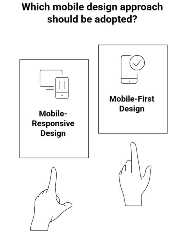
It’s important to differentiate between mobile-first and mobile-responsive design, as many businesses still confuse the two.
- Mobile-responsive design adapts a desktop site for mobile use. However, this often leads to compromises in performance, loading speed, and user experience.
- Mobile-first design means building a website specifically for mobile devices, ensuring the best possible performance and user experience from the start.
The mobile-first approach begins with the smallest screen and works upward, offering several benefits, particularly in terms of loading speed and mobile conversion.
The mobile-first indexing now standard in search engine algorithms, websites optimised for mobile are more likely to rank higher in Google’s search results.
A mobile-responsive website may look decent on mobile devices but can still struggle with performance issues, slow load times, and a suboptimal user experience, especially for B2B mobile optimisation.
Interested in learning more about how mobile-first indexing impacts your SEO? Explore our guide on mobile-first indexing to get a deeper understanding.
Critical Mobile Experience Elements for B2B
To truly make an impact, B2B websites must cater to the unique needs of mobile B2B buyers. Here are the key elements that drive B2B mobile conversion:
1. Navigation & Usability
- Thumb-friendly navigation, especially for larger screens
- Simple, clean menu structures that reduce clutter
- Easy access to critical business information like contact details, product specs, and case studies
2. Form Optimisation
- Reducing form fields and offering smart auto-completion to speed up data entry
- Progressive profiling to gather data gradually, rather than overwhelming the user
- Error handling and validation, ensuring that forms are easy to complete on mobile
3. Speed & Performance
- Mobile-first websites need to load quickly. Aim for a sub-3-second loading time.
- Image optimisation and accelerated mobile pages (AMP) are key to improving mobile performance
- Progressive web applications (PWAs) allow users to access key features even when they are offline
4. Content Strategy
- Focus on scannable content with mobile-first content hierarchy
- Collapsible sections for detailed information
- Easy-to-click CTAs, perfectly sized for mobile interactions
By aligning these elements with your mobile B2B strategy, you can ensure your website performs well across all mobile devices, enhancing user experience and boosting conversions.
Is your website optimised for mobile conversions? Find out how our ECommerce website services can enhance your B2B mobile experience.
Driving B2B Growth: Implementation Strategies for Mobile-First Websites
Moving towards a mobile-first approach requires careful planning and execution. Here’s how you can implement it successfully:
1. Design Approach
- Start with mobile wireframes and build upwards
- Use mobile design principles to prioritise simplicity and functionality
- Create content with progressive enhancement in mind
2. Development Considerations
- Set a performance budget for mobile to ensure fast loading times
- Test across different mobile devices and network conditions
- A/B test mobile conversion paths to find the best user journeys
3. Content Strategy Adjustments
- Audit your existing content and optimise for mobile consumption
- Adapt videos and resources for smaller screens and touch interactions
- Ensure that content such as case studies and whitepapers are easily accessible on mobile devices
Turning Mobile Traffic into Leads: Real B2B Results
Several B2B companies have seen remarkable success with B2B mobile optimisation, thanks to Newnormz’s mobile-first strategy. Here are two examples from our clients:
1. How Mobile-First Design Drove 45% More Conversions for JS Group

- The JS Group site attracted traffic but decision-makers struggled to access info on mobile.
- We applied a mobile-first design with simplified navigation and faster load times.
- Mobile conversions jumped 45%, with quicker responses and higher engagement from B2B clients.
2. Times Parking

- The Times Parking lead quality suffered due to clunky mobile forms and confusing navigation.
- We created a mobile-optimised experience with streamlined forms and clear CTAs.
- Qualified mobile leads improved by 60%, significantly boosting conversion rates.
These examples highlight how mobile-first design can boost conversion rates and improve lead quality, allowing businesses to stay ahead in a competitive B2B market.
See how businesses like yours have succeeded with mobile-first design. Visit our portfolio to learn more about our mobile-first web design projects.
Your Move: Power Up Your B2B Website
The shift to mobile-first B2B is becoming mandatory. As more buyers use mobile to research, evaluate, and purchase, businesses must adapt to this changing landscape.
Implementing a mobile-first strategy is an investment that will pay off in higher conversion rates, better customer engagement, and a stronger competitive edge.
Key Takeaways:
- B2B buyers are increasingly using mobile to make decisions.
- Mobile optimisation is crucial to providing a seamless experience.
- Implementing a mobile-first approach improves performance and conversion rates.
Ready to take your mobile B2B experience to the next level?
Don’t fall behind in the mobile-first revolution. Get in touch to optimize your B2B website for mobile today!


